Monday 18 October 2010

Researching header and footer designs.

For my second task I moved on to looking at header and footer designs. As part of my research I looked at a website http://www.csszengarden.com/ which is essentially the same HTML code displayed in different ways using different style sheets.

There really are some beautifully interesting designs, which are a real eye opener as top how simple graphics can be used as header and footer to really enhance a web page.

The thing that I really like about this web design is how well the header and footer bland into the web site. To me this looks really effective. All that this designer will have done is to make the back ground colour of the main website the same as the background on the image so the image and back ground blend together so you can’t see where it joins.


This is a really simple graphic that really sets the tone for the website. The header is the first thing that the viewer will see of the webpage. Therefore it is really crucial that it sets the right mood and tone.#

This is the footer of the page. Notice how it appears to blend in with the main body of the website so again you can't see where they join.


You can see here where the banner merges with the main body of the webpage. Rather than using one image for the back ground they will have used two different images for the header and footer and blended them in with the back ground. One advantage of this is that the load up time for the webpage will be much quicker as large images slow loading the webpage right down. It is much more efficient to have as smaller image files as possible to load as this reduces the time to load the webpage in a browser.


Here too are examples of how the header and footer can merge with the background colour to give the effect of them all been the same image. These designs are much simpler as they are not photographs but simple illustration. However they still serve their purpose set the mood and tone for the website, but it just goes to show that header and footer designs don't have to be over complex to have an impact.  


 As well as not seeing the join looks neater it seems to be a common convention of header and footer design at the moment.

In this example below they do make more of a feature of the header and footer, however it is just essentially text placed on a texted background. However it is really effective. This again shows that Headers and footer do not have to be over complicated to be affective.  


I choose the below example because to me it sort of breaks the conventions. The header does blend in with the background colour and is a main feature of the web page.


After looking at some of the header and footer designs out there and how simple designs can really enhance a web page I will now go on too sketching out some designs for my own header and footer.

Task Two - Experimenting with header and footer designs using CSS.

After looking at what HTML templates were available I wanted to look at how I could change those using CSS to change things like the colour schemes, headers, footers, etc.
Below are example of how I changed the templates.   

Above is just a screen shot of the webpage template displayed in a browser. This is a before shot to compare how I will alter the webpage using CSS.

And this shows a screen shot of the CSS displayed in dream weaver. This is the code that I will be changing I will not actually be making any of these changes in the HTML document. All of the changes will be made in the CSS document that will affect the styling of the web page.   

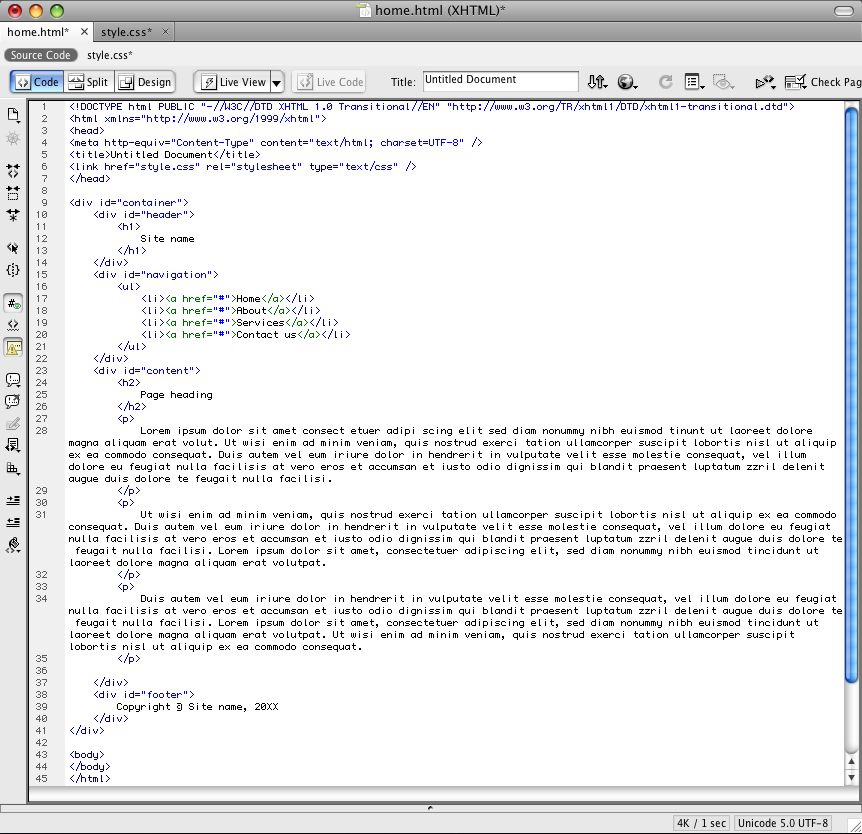
This is a screen shot of the HTML code displayed in Adobe dream weaver, as this is the programme I will be using to make my changes.  

Above I have changed the colours of both the header and the nav bar to pinks. I changed the title of the webpage to a possible title name for my website and I also added another item to the nav bar. These changes were done however inside the HTML document. I just wanted to experiment with how the information inside the HTML document can be changed using dream weaver too.
However I changed the colours of the header and nav barf in the CSS document. i simply using dream weaver selected the section I wanted to see what it was classed as. I then looked for this rule in the CSS document and then changed the colour for example from background:#fff; to background:#e000b3; which indicates that I wanted to change the back ground colour from white to the pink colour displayed in the browser. I did the same for the nav bar, text and also the roll over links.    

 Above shows a screen shot of the CSS after I had made the changes to compare with the earlier screen shot I took before editing.


Above shows also that I changed the colour of the footer to match the header, and also that I increased the size of the body of the page from 600px to 800px. I wanted to experiment with sizing as I plan for my web page to be fixed. So I will need to carry out some research and look at what will be the most appropriate sizes to have things like my header and footer.      


The above screen shot also shows the webpage been shown from the shared server. Because i uploaded a copy of my file to the server I can now view the web page from home or anywhere.

Here I wanted to experiment with using an image for the header. As large images take longer to load I made a small simple image using photoshop. I repeated it across the header to create this effect. Below is the image I used. Notice that it is actually very small, but when repeated see how it can create this header. 
 I also used this same image to create a matching footer as you can see below.


However the space for the header and footer image is too small so the whole image is not been displayed. I will now experiment with changing the size of the header and footer space so that the whole image will fit.


Compaired with the above screen shot you can see that i have incresed the header size so that now the full image is displayed in the header space. I done this by increasing the padding rule in the header div from 20 px to 45 px. This means that i imcreased the space around the heading to show the full header image.
In contrast in the example below for the footer i decreased the padding from 20px to 10px to decrease the size of the footer. As tradidtionally the footer space is smaller than the space for the heading.

It is intresting to see how a small repeated image can be used to creat a header and a footer for a webpage and how too they can be sytled using CSS.

The sizes for the header and fotter space in the example above are

Header - 130 px by 800 px

Footer - 40 px by 800 px

I am now going to experiment using graphics of the above sizes for the header and the footer space rather than using a reapeted image.


For my footer space i created this very simple design just to demonstrait how a full sized graphic could be used for the footer.  


And here is an example of the footer design above been used for the actual footer of my web page.


And above is the image I created for the header. Again it is just a very simple design just to demonstarit how a image could be used for the header of the web page.


The print screen above shows the above image been used a a header.


I also in the above example changed the colour of the text on the header and footer so it matches with the designs i have created.

I suppose there are examples to all of the different ways of creating header and footer designs.

Changing just the back ground colour allows you to create headers and footers quickly using just CSS. However only simple graphics can be created in this way.

Using a repeated image allows the image to be loaded quickly and just repeated across the space which could mean that the image will load quite quickly. Although this does result in a graphics again been quite simple designs which may or may not always be appropriate for the web page.

And with the last method i looked at adding a image the size of the header and footer space allows for more intricately designed and detailed headers but may result in the web page loading slower.

Although I think for my actual website that I design for this brief I will be using actual graphics that I create using Photoshop to allow the graphics to be more intricate and detailed.

Saturday 16 October 2010

Experimenting with CSS and looking at HTML templates.


I wanted to move on to looking at and experimenting with possible HTML templates that I will be using for my design. I will be getting the templates from http://www.maxdesign.com.au/articles/css-layouts/ . I firstly will look at what possible templates are available and how they can be changed with CSS before establishing which would be most appropriate for my own design. 
This is just a basic HTML template. The web browser just displays the information in this way because at this point I have not used a style sheet or any CSS to structure the webpage.
However there is some structure to the page as within the HTML code certain rules have been used to separate the information into paragraphs (<p>), Headers (<h1>), and even a list (<li>) with links. This list has been given an id attribute (#navigation) to establish this as the navigation bar. This will not make any difference to the information contained inside this attribute at the moment, but when it come to styling this sheet it will make it easier because it means that only information for the nav bar, (the information inside the #navigation attribute) will be effected by the style rules for this division. So rather than applying a style rule to everything wrapped in a <li> tag I have created this division to allow me to have another list in my web page if I so desired which would not be styled in the same way the nav bar is. 
This is a screen shot of the HTML code in the web browser before the style sheet is linked.


And this is a screen shot to show after the HTML document and the CSS document have been linked. To link the documents together i will be using <link rel=stylesheet href="css.css" type="text/css" media=screen>. So now all of the rules in this CSS document will apply to the infomation in the HTML document once displayed in a web browser.  


Thsi of course is a very basic layout with on column. I wanted to look at a few more examples of templates avalible on  http://www.maxdesign.com.au/articles/css-layouts/.

This is an example of a two column lay out. This second column is added again by creating a id div (<div id="aside">) to separate this information form the main body text so that when it comes to styling the sheet with CSS this information can be identified and placed in the appropriate place so that when it is displayed using an internet browser it appears as below.

Below is an example of a liquid layout website. This means that the layout is not fixed and moves depending on the size of the browser window. This is interesting and definitely something to consider when choosing the lay out for my own web pages. However I think I do prefer the fixed layout design as all of the websites I have looked at during my research are fixed layout and this does not seem to inhibit its impact.


Above shows the same website in a smaller browser window, notice how the layout changes to fit the window.
I feel now that I have a greater understanding of how some simple CSS can dramatically change the appearance of a webpage when displayed in a browser. I also feel I now have a greater understand of the importance of classifications and id divisions and how they can aid the styling of a web page.

 I will now move on to looking at how I can alter these CSS template to structure the change the colours, font sizes/family, alignments, etc.  

Sunday 10 October 2010

Experimenting with code. (HTML)

After researching some websites and identifying their design features I wanted to experiment a little by writing some of my own basic HTML and CSS code to create my own simple web pages.  


This is a screen shot of the simple code I wrote to construct my first simple web page. Although not structured this website contains a main body of text, links to a second page and photograph. Also by using code within the HTML document I experimented with making some of the text bold, italic, etc. Just to see how much I could manipulate the web site form with in the HTML document.

And this is a screen shot of my first basic webpage in internet explorer.
This is a screen shot of the basic code for the second webpage i made. There is a link to the second page from the first page and then a link from the second page back to the first page and also my blog on the second page.


 And below is a screen shot of the webpage in internet explorer.


I have found this excersie very useful as it is intresting to see how just a few lines of HTML can create a web page. Next i will be looking at how CSS can be used to structure a webpage and make it look more professional.

Monday 4 October 2010

Task One - Researching the web.

For my first assignment for my web design modual i was asked to look at and compare a number of static web sites to see if i could identify the common conventions of a web site. but i also wanted to include some more unusual and creative designs inorder to gain inspiration for future assignments.

I started off by look at a rather basic website just to identify the conventions.

The first website i looked at was http://disparue.org/gallery/. This is an online gallery for screen captures from popular television shows. This design is very simple. It consists of a title at the top to show what the website contains and who designed it. There are two links below that to allow the user to navigate around the site. The content is displayed very basically down the left hand side and a simple table has been used to display photographs and information.


I choose to look at online galleries because the website I was given to design for a later task is for a tattooist who will be using the website to display photographs of their work, so I thought I would get a head start by exploring this genre for my research task.

I then moved on to looking at a slightly more complex website. This too is an online gallery for screen caps called screencap paradise - http://www.screencap-paradise.com/.

This website includes the common conventions such as a title, a body of text, headings, and a navigation bar. It also includes a banner to set the mood of the web site and to give the viewer a sense of what to expect from the website. Here a photograph of a tropical beach it used to convey the idea of paradise. Also a table has been used to display the contense of this website. It looks like three columns have been used with the main body of text and images in the centre, a smaller column for additional links for navigation down the left hand column and a column down the left hand side for other information such as terms and conditions of use.  


I then looked at http://www.fractured-simplicity.net/  which is another online gallery for displaying work. Although this website appears to be a lot more complex than the on above, it is in fact a much simpler design consisting for just one basic table with the nav bar along the top.


However I think that it is the fact that this web site is more colourful and the use of graphics that make this web site look more complex than it actually is.  
I then moved on to looking at more unusual and creative designs. 

http://missm.paperlilies.com/ is a good example of how graphics can make a very simple web site look quite complex. This home page contains very basic information and just a few links for navigation which are beautifully worked into the design.
The graphics also reflect the personality of what can be found on this website as it is a gallery for hand made Photoshop brushes. The graphics too look delicate and hand made automatically giving the viewer a sense of the content of this web site.

The last website I looked at was http://www.deadly-nightshade.com/. I really like the creatively unconventional layout of this website. Again this website contains all of the usual convention, such as a banner, navigational links, and main body of text and images (displayed in a table).

However the banner has been unusually placed down the left hand side of the page with the navigational links placed over and integrated to become part of the composition. This therefore resulting in the main body of text and images been displayed more towards the right hand side. This fresh layout conveys high quality and creative as well as been very aesthetically pleasing. I am sure this home page would encourage any viewer to explore the website future.


I have found looking at the different layouts and designs very useful and will be taking all of this research on board when I begin to design my own website for this project. I have particularly found interesting the different layout styles and how just simple things like placing the banner in an unusual place can have a very interesting effect on the whole composition of the page.